From Manuscript to Print: The Gutenberg Bible and the End of the Medieval Book
The Last Medieval Book
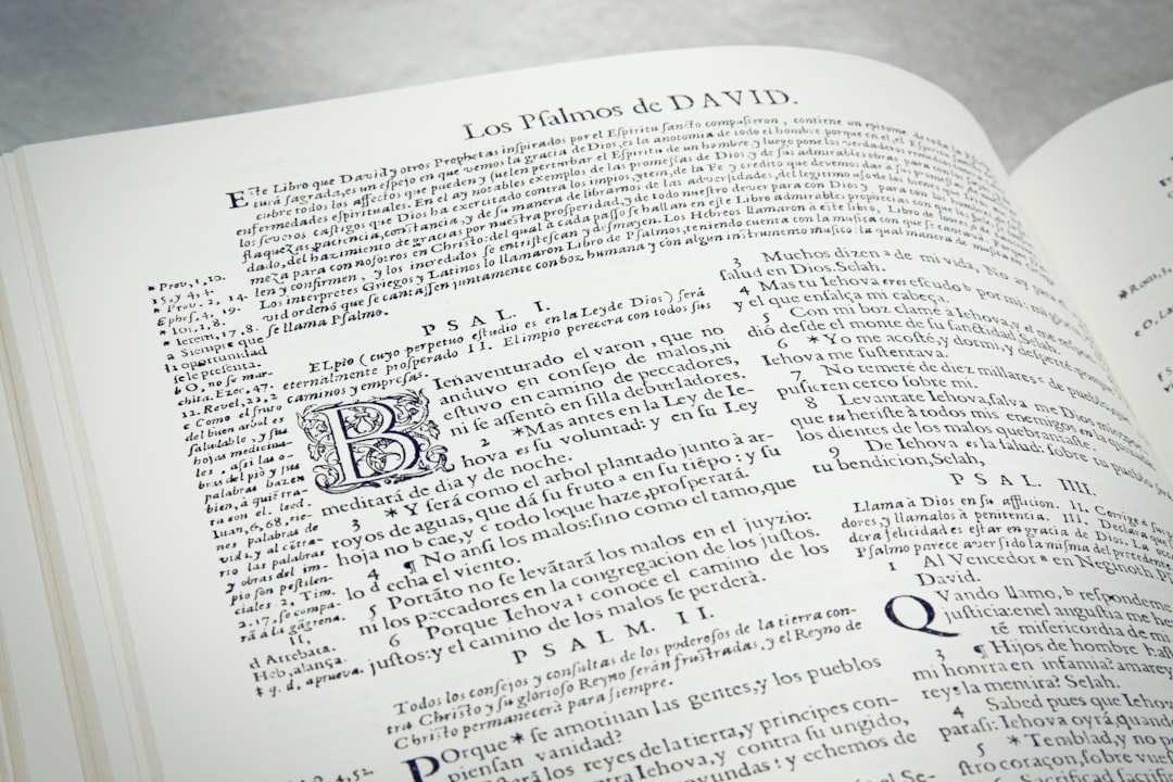
The Gutenberg Bible (also known as the 42-line Bible or the Mazarin Bible) occupies a paradoxical position in the history of the book: it is simultaneously the greatest achievement of medieval book art and the first major work produced by mechanical printing. Gutenberg's typeface was modeled on the Gothic textura script used by contemporary German scribes — the same script that illuminated the prayer books and Bibles of the 15th century. The result is a printed page that, to a contemporary viewer, was virtually indistinguishable from a manuscript.
The Bible was printed on a press adapted from the wine presses of the Rhineland, using movable type cast from a lead-antimony-tin alloy that Gutenberg developed with the assistance of the goldsmith Peter Schoeffer. Each letter was individually cast, assembled into pages in a composing stick, locked into a forme, inked with an oil-based ink (a crucial improvement over the water-based inks used for woodblock printing), and pressed onto paper or vellum. The process required approximately 200,000 individual pieces of type and an investment of several years to complete.
Hand-Rubrication and the Persistence of Manuscript Culture
Despite being printed, the Gutenberg Bibles were not intended to replace illuminated manuscripts. Many copies were sent to professional rubricators — scribes who added the red headings, initials, and decorative elements that were standard in contemporary manuscripts. These hand-painted additions vary enormously from copy to copy, reflecting the tastes and budgets of individual purchasers. The copy in the British Library, for instance, features elaborate gold initials in a Gothic style that would be at home in a 15th-century Book of Hours, while the Huntington Library copy has simpler red and blue initials with minimal decoration.
This hybrid character — mechanically printed text with hand-painted decoration — captures the transitional moment in which the Gutenberg Bible was produced. The book was manufactured using a revolutionary technology, but its aesthetic was thoroughly medieval. The purchasers who commissioned rubrication expected their printed Bibles to look like manuscripts, because manuscripts were the standard against which all books were judged. It would take several decades for the aesthetic of the printed page to develop its own conventions, independent of the manuscript tradition it had inherited.
Impact on Medieval Art
The printing press did not immediately destroy the market for illuminated manuscripts. Books of Hours continued to be produced by hand well into the 16th century, particularly for wealthy patrons who valued the uniqueness and craftsmanship of the manuscript form. However, the economics were inexorably shifting: a printed book cost a fraction of its manuscript equivalent, and the gap in quality was narrowing as printers refined their techniques and type designs. By the 1520s, the manuscript book had become a luxury item — a deliberate choice of tradition over economy, much as the vinyl record persists in an age of digital streaming.
For the history of medieval art, Gutenberg's invention marks the endpoint of a tradition that had begun with the catacomb frescoes of the 3rd century and reached its apogee in the illuminated manuscripts of the 15th. The art of the medieval book — the interlace of the Lindisfarne Gospels, the gold-ground miniatures of the Tres Riches Heures, the marginal drolleries of the Gothic psalters — was a thousand-year conversation between text and image, sacred content and decorative form. Printing transformed that conversation into a monologue: the text became fixed, reproducible, and permanent, while the image retreated to the margins, eventually to become the engraved illustration that would accompany the printed word in the modern era.