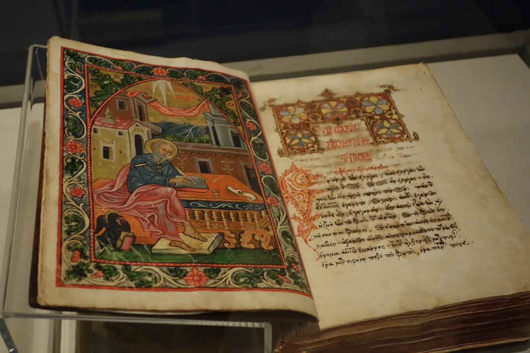
Information Architecture Existed Before Computers
Medieval scribes faced the exact same problem that web designers face today: how do you guide readers through complex, lengthy content in a way that is intuitive, navigable, and visually engaging? In a world where most people couldn't read, they needed visual systems to communicate structure, hierarchy, and meaning.
They developed solutions that are remarkably familiar to anyone who works in digital design. Hierarchical sizing — important text got bigger, less important text smaller. This is the direct ancestor of the H1/H2/H3 heading system that structures every webpage on the internet. Color coding — red ink was used for rubrics (instructions and headings), giving us the word "rubric" from the Latin ruber (red). This is the ancestor of CSS color systems and the modern practice of using color to signal function (red for errors, green for success, blue for links). Decorated initials — elaborate, illuminated capital letters marked the beginning of new sections, serving as visual wayfinding markers. These are the ancestors of drop caps and section dividers. Marginal cross-references — notes in the margins pointing readers to related passages functioned as an early form of hyperlinks.
Every time you use a heading hierarchy, a color-coded button, or a hyperlink, you are participating in a design tradition that is over a thousand years old. Medieval scribes were the original information architects.
The Ultimate Hero Section
Every web designer knows the purpose of a hero section: stop the visitor, communicate importance, and draw them deeper into the content. The Book of Kells' chi-rho page (folio 34r), created by Celtic monks around 800 CE in what is now Scotland or Ireland, is arguably the most effective hero section ever designed.
At 37cm x 27cm, the chi-rho page is pure visual impact. The monogram of Christ (the Greek letters Chi and Rho) explodes across the page in a riot of spirals, interlace, and hidden animals. Every detail rewards closer looking — spirals within spirals, animals camouflaged within letterforms, geometric patterns that seem to pulse with energy. It does exactly what a good hero section does: it stops you dead and says "pay attention, this matters."
But here's what modern designers can learn from medieval restraint: the chi-rho page is complex but organized, busy but with clear focal points. The eye is drawn to the central monogram first, then guided outward to the surrounding decoration, then drawn back to the center. There is a visual hierarchy even within apparent chaos. Modern web designers often over-decorate hero sections with competing elements. The medieval example shows that complexity and clarity are not opposites — they can coexist when there is a strong central organizing principle.
Medieval Color Palettes Dominate Luxury Branding
Walk into any luxury brand's flagship store — or visit their website — and you'll find a familiar palette: deep blue, rich red, gold accents, rich green. This is not a coincidence. The visual language of prestige was established by medieval artists and their patrons, and it persists today because those pigments communicated wealth in the most literal sense possible.
Consider the materials: lapis lazuli blue — ultramarine pigment, literally "beyond the sea," imported from mines in Afghanistan across thousands of miles of trade routes, more expensive than gold by weight. Vermilion red — mercury sulfide, mined in Spain, toxic and costly. Gold leaf — hammered to 0.1 microns thick, requiring enormous skill and labor. Malachite green — ground from the copper carbonate mineral, vibrant and rare. Tyrian purple — extracted from thousands of sea snails, literally worth its weight in gold in the ancient world.
These pigments didn't just look expensive — they were expensive. When a medieval patron commissioned an illuminated manuscript or a painted altarpiece, the cost of materials alone was a statement of wealth and devotion. The association between these specific colors and prestige was forged in the Middle Ages and has never been broken. Look at any luxury brand's visual identity and you'll find the same palette, because the medieval color hierarchy still governs our visual instincts about what "looks expensive."
Why Medieval Colors Still Signal Luxury
The psychological impact of medieval pigments goes beyond mere cost. These colors carry centuries of cultural association with sacred art, royal patronage, and the highest achievements of craftsmanship. When a modern brand uses deep blue and gold together, it is unconsciously invoking the visual language of medieval cathedrals and illuminated manuscripts — the most prestigious artistic contexts European culture has ever produced. The colors carry the weight of that history, even when the viewer isn't consciously aware of it.
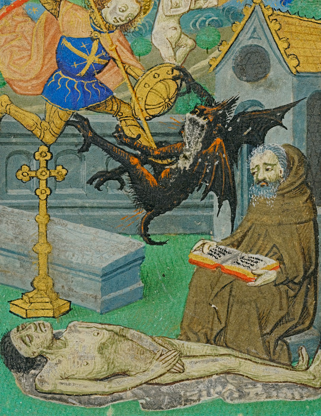
Marginalia as UX Delight
Medieval manuscripts are famous for their weird marginal drawings — killer rabbits attacking armored knights, snails jousting with humans, a nun picking penises from a tree, butt-playing bagpipers. These absurd images have made medieval manuscripts a staple of internet meme culture, but their original function is surprisingly relevant to modern design.
These marginal drawings served the same function as Easter eggs in software or delightful micro-interactions in mobile apps: they rewarded careful users with unexpected surprises. A monk laboriously copying a psalter would turn a page and encounter a drawing of a knight fighting a snail. He would smile. That smile — that moment of unexpected delight — is the medieval equivalent of discovering a Google doodle, finding a hidden animation in a loading screen, or stumbling upon a witty error message.
Modern UX design has a term for this: delight. It's the extra layer of experience that transforms a functional interface into a memorable one. Medieval scribes understood this intuitively. They knew that even in the most sacred texts — psalters, gospels, Books of Hours — there was room for playfulness, for surprise, for the kind of visual humor that makes the reader pause and engage more deeply with the content.
The lesson for modern designers is clear: don't underestimate the power of unexpected delight. Your users are scrolling through interfaces all day. A moment of genuine surprise — a clever animation, a witty microcopy, an Easter egg for the curious — can transform their entire experience of your product. Medieval scribes figured this out seven hundred years before the iPhone.
Flat Design Is Medieval Design
The current trend toward flat design — no shadows, no gradients, bold outlines, solid colors — looks remarkably like medieval manuscript painting. This is not an accident.
Both approaches reject perspective and naturalism in favor of clear, symbolic communication. A medieval painting of a king doesn't need realistic proportions — it needs to communicate "kingness" through crown, scepter, and larger-than-life size. A flat design icon doesn't need drop shadows or gradients — it needs clear shapes and colors that communicate function instantly. Both prioritize recognition over realism.
Consider the similarities: medieval manuscripts use bold outlines to define forms; flat design uses clean vector paths. Medieval paintings use solid, unmodulated colors; flat design eschews gradients for pure color blocks. Medieval compositions are organized hierarchically rather than perspectivally; flat design layouts use visual weight and size to create hierarchy. Even the color palettes overlap — both traditions favor strong, saturated colors that read clearly at any size.
The irony is delicious: the tech industry's most cutting-edge design trend — flat design, championed by Apple, Google, and Microsoft — is essentially a return to medieval visual principles. We spent five centuries mastering perspective, chiaroscuro, and photographic realism, only to circle back to the flat, symbolic, hieratic visual language of the Middle Ages. Medieval artists didn't lack the skill to paint realistically (as later periods demonstrated) — they chose not to, because flat, symbolic communication was more effective for their purposes. Modern designers have arrived at the same conclusion.
Medieval Art Was the Original User Interface
Before mass literacy, images were the primary medium for communicating complex information to the public. This makes medieval artists the original UX designers — they were creating visual interfaces for accessing information, centuries before screens existed.
Stained glass windows were called "the Bible of the poor" (biblia pauperum). They told biblical stories in colored glass, arranged in sequences that parishioners could "read" without being able to read text. Each window was a page, each panel a paragraph, each figure a character. The light itself was the interface — it transformed the building into an information display.
Sculpted portals on cathedral facades told the entire history of salvation in stone, from Genesis to the Last Judgment. The arrangement of figures followed a clear visual hierarchy: Christ in the tympanum (the main panel), saints and apostles in the archivolts (the surrounding arches), ordinary people and zodiac signs in the lower registers. This is information architecture in stone.
Illuminated manuscripts combined text, image, and navigation systems into a single, integrated interface. The decorated initial told you where a new section began. The marginal note pointed you to related content. The miniature illustration summarized the text that followed. The gold leaf told you this was important. Every element served a functional purpose — they were designed to help readers access, understand, and navigate complex content.
Modern UX designers are doing the same thing, just with screens instead of parchment. The medium has changed. The fundamental challenge — making complex information accessible, navigable, and engaging through visual design — has not.
The Takeaway for Modern Designers
So what should a modern designer take away from a thousand years of medieval art?
Visual hierarchy is timeless. Whether you're using H1 tags or illuminated initials, the principle is the same: guide the eye, signal importance, create a path through the content. Medieval scribes were masters of this, and their techniques remain relevant.
Delight matters. The weird marginal drawings of medieval manuscripts remind us that even serious content benefits from moments of surprise and playfulness. Your users will remember the Easter egg long after they've forgotten the main feature.
Symbolic clarity beats naturalistic detail. Flat design proves what medieval artists always knew: you don't need realism to communicate effectively. Sometimes a bold shape and a strong color say more than a photograph ever could.
Design is an interface to understanding. Whether it's a cathedral portal or a mobile app, good design helps people access information they wouldn't otherwise be able to reach. That's what medieval artists did. That's what you do. The tradition is older and more continuous than you might think.
Related Reading
- → The Book of Kells: The Most Beautiful Manuscript in the World — An in-depth look at the medieval masterpiece discussed in this article.
- → Byzantine Art (4th–15th Century) — The gold-ground mosaics and icons of the Eastern Roman Empire.
- → Gothic Art (12th–15th Century) — The stained glass and sculpture that turned cathedrals into light machines.
- → About History Canvass — Learn more about our mission to make medieval art accessible.
Frequently Asked Questions
References
Camille, Michael. Image on the Edge: The Margins of Medieval Art. Reaktion Books, 1992.
Dodwell, C. R. The Pictorial Arts of the West, 800–1200. Yale University Press, 1993.
Norman, Don. The Design of Everyday Things. Basic Books, 2013.
Parkes, M. B. Scribes, Scripts and Readers: Studies in the Communication, Presentation and Dissemination of Medieval Texts. Hambledon Press, 1991.
Saenger, Paul. Space Between Words: The Origins of Silent Reading. Stanford University Press, 1997.